
Geospatial Explanatory Modeling of the U.S. Drug Overdose Epidemic
Check out this slide deck to get a quick overview of this project:
I Introduction
Throughout the years, there has been a dramatic increase in drug overdoses. We are currently at the point where overdoses are the cause of more deaths than car accidents, guns, or HIV. [1] Since 1999, there have been about 1 million fatal overdoses in the United States and just within the past year, over 100,000 have lost their lives due to overdose. [2] It is very clear that the drug epidemic is a widespread societal problem that needs to be properly researched and addressed. To do so, our team will be analyzing the number of fatal overdoses in United States counties throughout the last 20 years and exploring the question: Which characteristics of U.S. counties can best explain drug overdose rates? We also hope to estimate overdose rates in the counties that are missing data in our main overdose dataset. The successful completion of these tasks will allow us to provide policy makers with valuable information about the areas of the U.S. that are not easily observed simply with the raw overdose counts as well as insight as to what factors to focus on and which communities should be addressed more urgently when trying to counteract the drug overdose epidemic.
II Data Description
Data Generation
Our team obtained our drug overdose data from the CDC Wonder Search website by requesting data that specifically pertains to overdoses using their “underlying cause of death” codes. [3] The CDC collected this data through the Vital Statistics Cooperative to provide health departments and the general public with open access to detailed information that is beneficial in public health research and decision making.
Variables of Interest
Our primary overdose dataset provides variables of interest such as year, county, overdose death count, and county population. We used these features to calculate the Overdose_Rate_per_100k which is the number of overdoses per 100,000 people. This will act as our main variable of interest. In this dataset, we observe a varying number of counties each year. However, the number of observed counties does increase throughout the years (Figure 1) and we have also confirmed that each year of data includes more than 50% of the United States population,
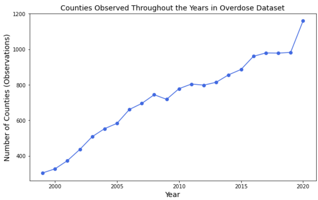
Figure 1. Number of Observations included in Overdose Dataset by Year
despite missing a significant amount of counties. We have also gathered additional datasets detailing various factors that may relate to overdose rates (opioid dispensary rates [4], unemployment rates [5], ethnicity [6], poverty [7], median household incomes [7], jail populations [8], and other various health-related characteristics [9]). We have acquired all of our data by county and will be analyzing the relationships between our chosen features at this granular level. Unfortunately, we were unable to locate accurate and robust data for some of our additional variables on a county level before 2011. Hence, our analysis will focus on the years 2011 to 2020 in order to minimize the number of missing values while maintaining the wide time range of a decade. The final version of our dataset (Figure 2) includes 31,420 rows and 44 columns.
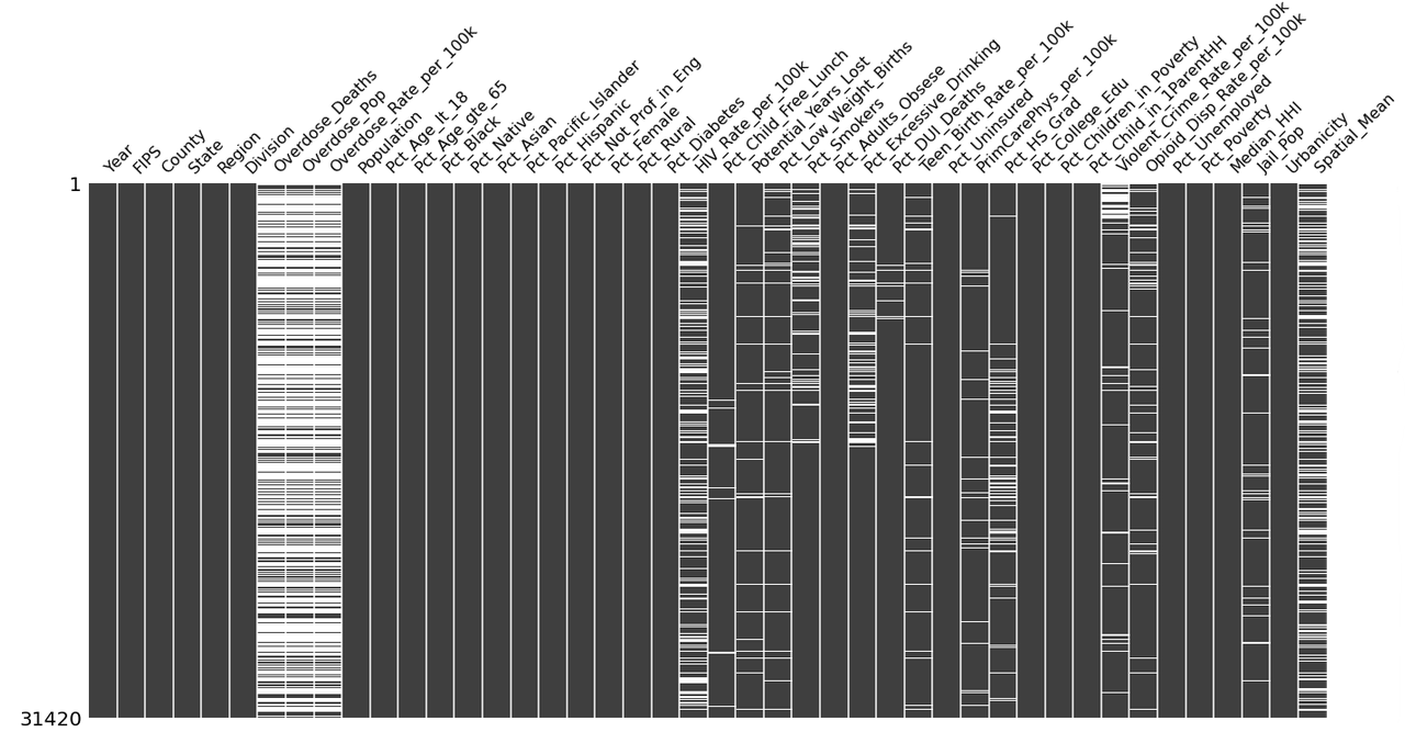
Figure 2. Visualizing Missing Data in Final Dataset (2011-2020)
Note: The figure above details the missing values of our data frame after merging our covariates with all U.S. counties. Black represents the available data. White represents the missing values. 31420 indicates the number of rows in our overall data frame.
Hypothesized Relationships
Our team hypothesized that socioeconomic status would be closely connected to overdose rates. Hence, we included variables such as poverty and unemployment rates, assuming that overdose rates would be higher in counties where these factors were higher. We included median household income as well, presuming that counties with a lower median income would correspond with counties with higher overdose rates. We also surmised a possible association between higher opioid dispensary rates and higher overdose rates. Additionally, we explored the jail populations of each county, supposing that increased crime rates would correlate to higher drug use and therefore, a higher overdose rate. We considered the possibility that minority groups would be disproportionately affected by the epidemic and therefore, included each county’s ethnicity and sex demographics as well. We also collected multiple features relating to health such as the percent of residents who are uninsured, are smokers, or are excessive drinkers, presuming that lower access to health care and higher rates of health complications would be related to higher overdose rates as well. Our team postulated that the urbanicity and total population of a county would be positively correlated with drug overdoses as well. Due to the clustering of higher overdose rates in different areas of the United States which can be seen in Figure 3, we hypothesized that the geographical location of each county and their relative positions with each other would also be a strong indicator of overdose rates. So for each county, we calculated the average overdose rate of its adjacent counties during that year - which we labeled Spatial_Mean - believing that higher overdose rates in neighboring counties would correspond to a higher overdose rate in the focal county.
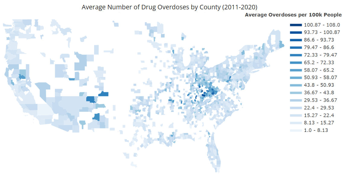
Figure 3. Average Drug Overdoses per 100k People in United States by County (2011-2020)
III Methods
Moran’s I
We first utilized Moran’s I to determine the significance of the spatial component in our data. In particular, we are measuring how similar one county’s overdose rate is to all other counties. Moran’s I can be calculated with
\[I = \frac{n \sum_{i=1}^{n} \sum_{j=1}^{n} w_{i,j} z_{i} z_{j}}{\sum_{i=1}^{n} \sum_{j=1}^{n} w_{i,j} \sum_{i=1}^{n} z_{i}^2}\]such that $n$ is the total number of counties and $z_i$ is an overdose rate’s deviation from its mean $(x_i - \bar{X})$ for county $i$. Similarly, $z_j$ is an overdose rate’s deviation from its mean $(x_j - \bar{X})$ for county $j$. $w_{i,j}$ is the spatial weight between the $i$-th and $j$-th county. More specifically, $w_{i,j}$ is a weight matrix having a 1 where county $i$ is adjacent to county $j$ and a 0 when the $i$-th county is not adjacent to the $j$-th county. [10] Typically, Moran’s I values range from -1 to 1 and, as a general rule of thumb, a value below -0.3 or above 0.3 is deemed to be significant. Our Moran’s I is about 0.461 for our United States overdose data, indicating a significant positive spatial autocorrelation relationship between the counties. Hence, we ensured that our spatial component, Spatial_Mean (explained in Section 2), is taken into account in our first round of modeling.
OLS Regression
Throughout our modeling, we used a general ordinary least squares (OLS) regression which is given by
\[y_{it} = \beta_{0} + \sum_{k=1}^{p} \beta_{k} x_{itk} + \epsilon_{it}\]such that $y_{it}$ is our drug overdose rate of county $i$ in year $t$, $x_{itk}$ is the $k$-th explanatory variable of county $i$ in year $t$, $p$ is the total number of features included in our model, $\beta_k$ is the global coefficient that describes the relationship between the $k$-th feature and our response variable, $\beta_0$ is the global intercept coefficient, and $\epsilon_{it}$ is the random error term associated with county $i$ during year $t$.
Baseline Model
For our baseline model, we used an OLS model, running the log of the overdose rates against only the spatial mean. We decided to log transform our overdose variables since they were skewing towards the right. As seen in Figure 4, our overdose rates were much more normally distributed after performing a log transformation.
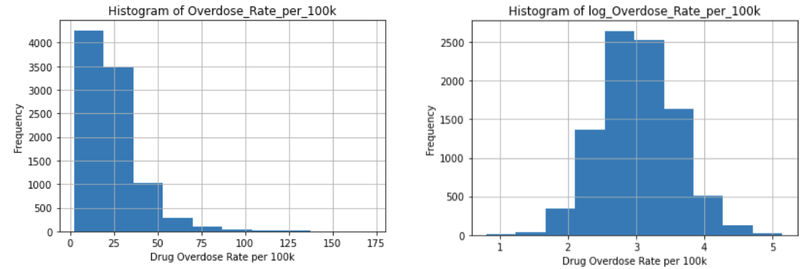
Figure 4. Histogram of Overdose_Rate_per_100k (pictured on the left) and Histogram of log(Overdose_Rate_per_100k) (pictured on the right)
The results of this model ⎯ log(Overdose_Rate_per_100k) ~ Spatial_Mean ⎯ can be seen in Table 1. In particular, our baseline returned an adjusted R-squared of 0.451, indicating that our spatial component already accounts for a considerable amount of the variation in our data. Additionally, we observed a normalized RMSE of 0.0938, telling us that our baseline is already a pretty good fitting model since this value is close to zero.
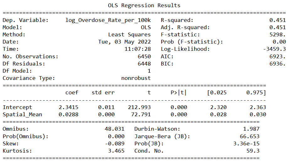
Table 1. OLS Regression Results of Baseline Model
Note: Our baseline model is log(Overdose_Rate_per_100k) ~ Spatial_Mean
Backward Stepwise Feature Selection
After exploring our baseline model, we performed a backward selection to determine which of our features can most explain overdose rates. Since many of our features are related to each other and there is quite a bit of multicollinearity present within our data, we opted to use a backward selection instead of a forward selection as it is more suited to dealing with colinearity. We utilized 5-fold cross-validation and, with RMSE as our metric, determined that our best model includes the following 8 features:
| Feature Name | Description |
|---|---|
Spatial_Mean | the average overdose rate of counties adjacent to the focal county |
PrimCarePhys_per_100k | the number of primary care physicians per 100k residents |
Pct_Uninsured | the percentage of uninsured residents |
Pct_Child_in_1ParentHH1 | the percentage of children living in households with one parent |
Pct_Poverty | the percentage of residents living in poverty |
Pct_Black | the percentage of Black residents |
Pct_Age_lt_18 | the percentage of residents who are less than 18 years old |
Potential_Years_Lost | the year of potential life lost before age 75 per 100k residents |
Table 2. Description of Features Found from Backward Stepwise Feature Selection
Variable Transformations
After modeling our logged overdose rates against the features found from our backward selection, we plotted the residuals against each of the selected covariates. Figure 5 shows the residuals plots of the variables that we decided to transform ⎯ Pct_Black, PrimCarePhys_per_100k, and Spatial_Mean. We can see how the plots on the left-hand side are more skewed towards the right. However, after performing the log transformations, the observations are scattered more randomly about the horizontal line. We should also note that we added 1 to our Pct_Black variable before log transforming it since many of the observations were very close to zero.
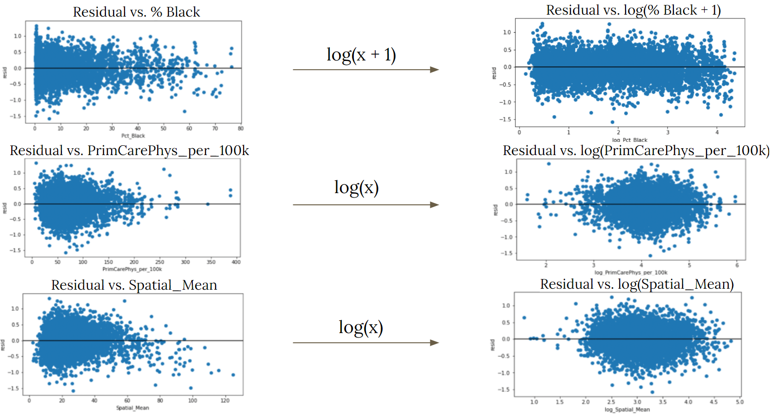
Figure 5. Comparison of Residual Plots Before and After Transformation
We then continued on, using these transformed variables in our final model:
log(Overdose_Rate_per_100k) ~ log(Spatial_Mean) + log(PrimCarePhys_per_100k) + Pct_Uninsured + Pct_Child_in_1ParentHH + Pct_Poverty + log(Pct_Black + 1) + Pct_Age_lt_18 + Potential_Years_Lost
IV Results
Final OLS Regression Results
In Table 3, we observe the results of our final OLS regression and compare some of the essential findings to those of our previous models. At the top of the table, we can see the adjusted R-squared and AIC scores of our baseline model, our model using all variables pre-transformation, and our model using the variables that were transformed. As we go from the left to the right side of our table, the adjusted R-squared values increase and the AIC scores decrease, signifying improvements in the performance of each of our subsequent models. We should also note that the coefficients shown in our table are not interpretable in a straightforward manner due to the multicollinearity that is still present between our covariates. However, we are mainly concerned with the highlighted significance values. And since they are all zero, we can say that the features included in our model are all significant in explaining our overdose rates.
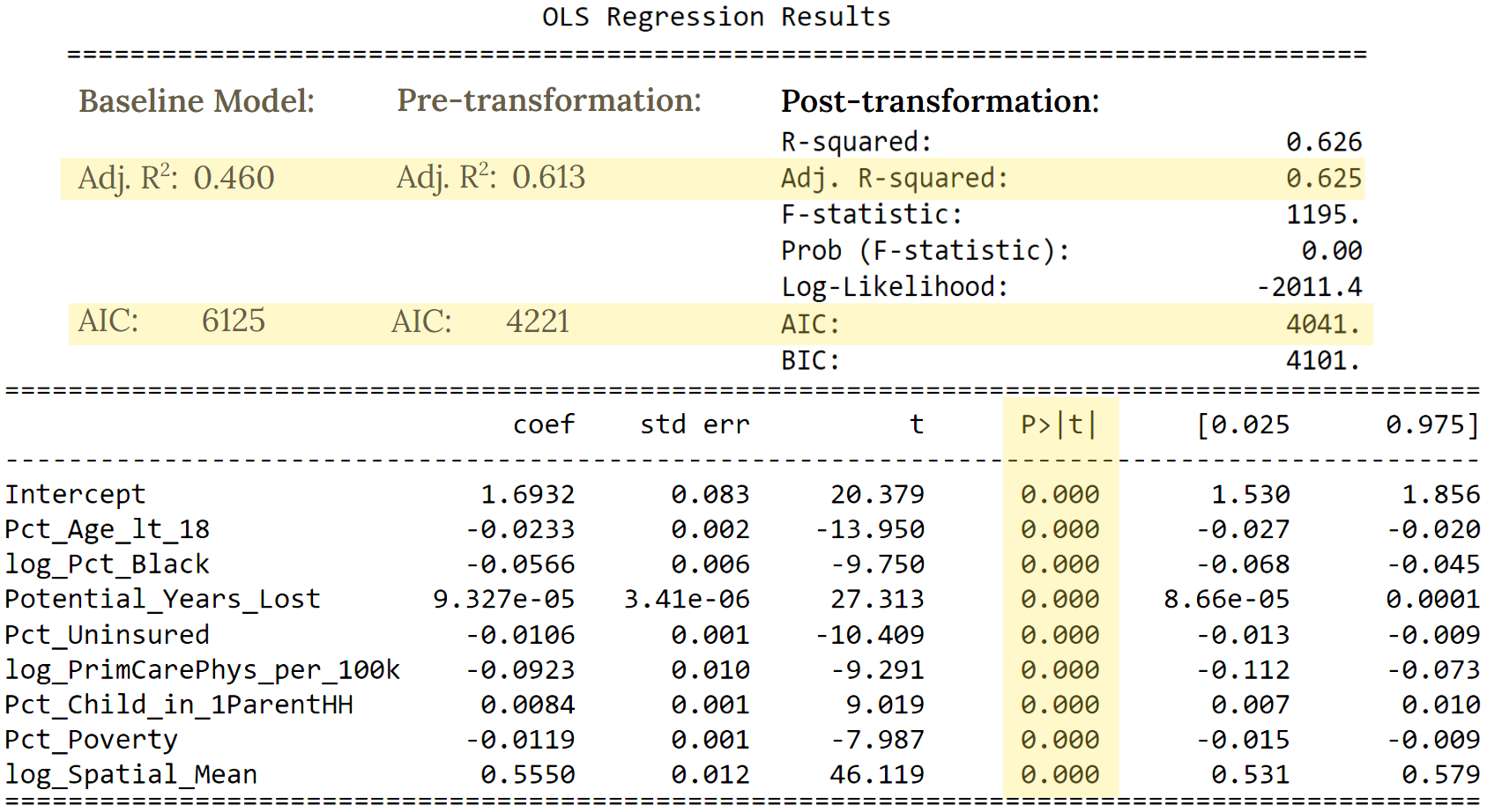
Table 3. OLS Regression Results of Final Model with Comparisons to Previous Models
We also observed that the normalized average cross-validated RMSE was 0.0788 for both the training and testing RMSE. Because these values were close to zero and were lower than the normalized RMSE of our baseline model, we can say that our final model’s fit is not only good but also an improvement of our baseline’s.
In Figure 6, we showcase the residual map of our final model for the year 2020. It suggests that our model adequately explains the spatial aspect of our data since the residuals seem to be scattered randomly throughout the map. Moreover, the Moran’s I for the residuals was -0.098, deeming the spatial autocorrelation of the residuals to be insignificant and further confirming that our model has successfully accounted for the spatial component of our data.

Figure 6. Map of Residuals of Final Model in Year 2020
Filling in our Map
With our final model, we filled in our map. We began by using the model to estimate overdose rates in counties that were adjacent to ones in which overdose rates were already available. We filled in these particular counties first since being next to a county with a known overdose rate would allow them to have a Spatial_Mean value. Then using the newly estimated overdose rates, we calculated the Spatial_Mean of any counties that were adjacent to those that now had overdose rates, thereby giving these new counties the information required to pass through our model and obtain an estimated overdose rate. We then repeated these steps until our map was filled in. This process can be also seen more visually in Figure 7.
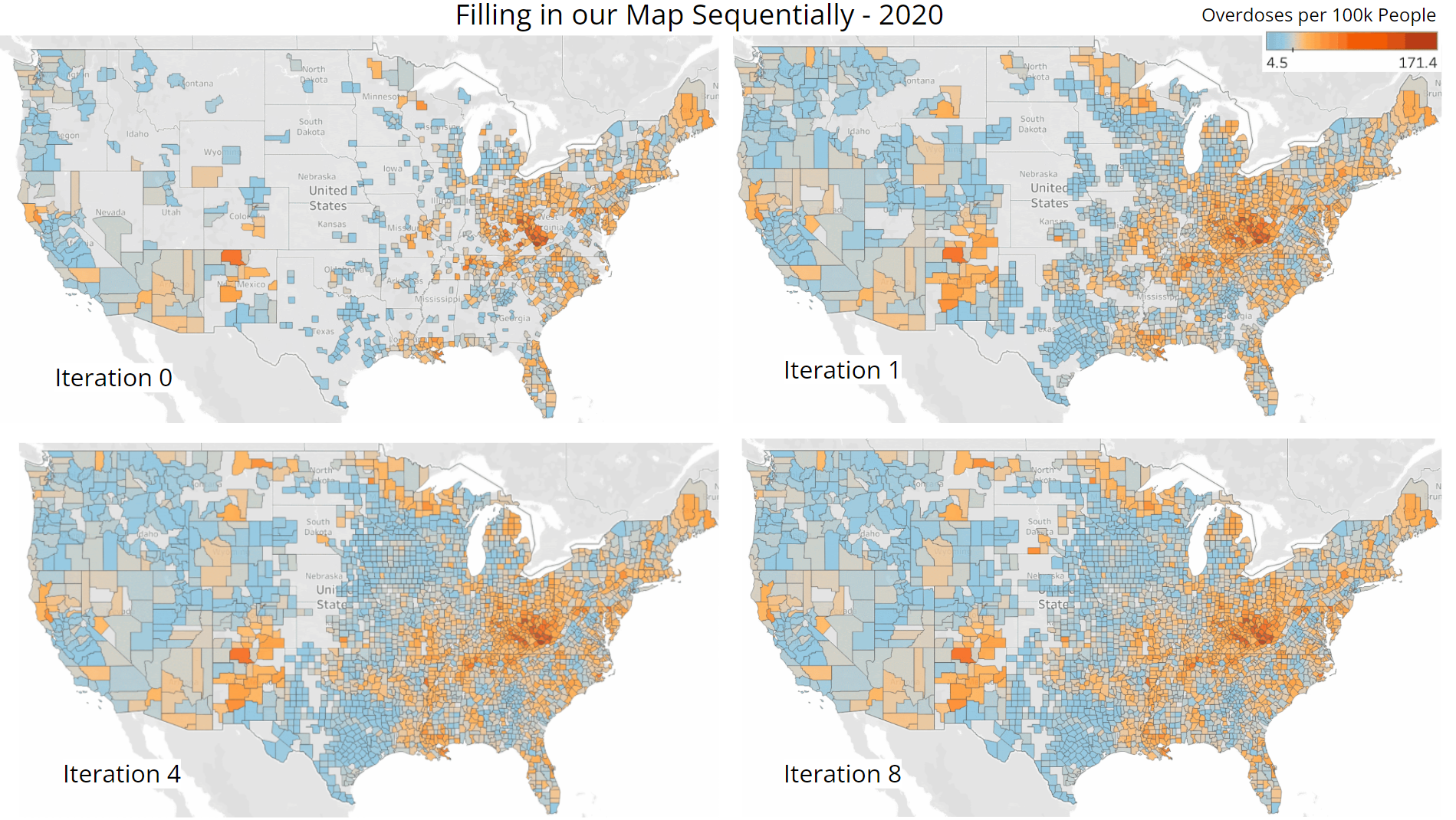
Figure 7. Visualization of Sequential Procedure Used to Fill In our Map of Overdose Rates
Iteration 0 displays the overdose rates that were already available in the dataset procured from the CDC. Iteration 1 showcases the counties we were able to fill in after performing one iteration of the process described above. Surprisingly, a substantial number of counties were already estimated through this single first step. Iteration 4 shows what our map looked like near the middle of the procedure and Iteration 8 shows the final state of our map after completing our recursive estimation process. Some counties still have not been filled in even after the final iteration because they are missing data pertaining to other features that are included in our model. Nevertheless, we are able to estimate overdose rates for the majority of our map despite these limitations. We should also note that because we are estimating using estimates, it is likely that slight deviations from the true values can build up throughout this process, leading to even greater differences as we approach the middle of our map. However, seeing that the expected clustering trends of higher and lower overdose rates are present, we can presume that our map is able to give a rather accurate overview of the drug overdose epidemic.
V Conclusions
Now, with these findings, our team is able to provide policy makers with more insight as to how to counteract the drug overdose epidemic more effectively. By filling in our U.S. map with estimates, our team can equip policy makers with a greater understanding of the areas that were previously missing overdose rates. After determining which covariates would be included in our final model, we found that the relative location of each county is particularly crucial in explaining overdose rates. We would suggest that policy makers focus on counties with severely high rates and their surrounding counties, as greater drug overdose rates are likely to spill over to nearby areas. By considering various health-related factors, we found that policy makers should focus on increasing health care availability since the percentage of uninsured residents and the ratio of primary care physicians to county residents were 2 out of our 8 chosen features. After looking at numerous county demographics and economic factors as well, we would also advocate for policy makers to aim more attention towards youth aged less than 18 years, the black community, residents living in poverty, and single-parent households. Given the performance of our model, we also acknowledge that there is still room for improvement. Naturally, there is the possibility that other confounding variables we were unable to take into account may have been a large factor in explaining overdose rates. The implementation of other methods such as a time series or weighted least squares model could also further our findings as well. All in all, this is a very complex societal issue that is still being explored today and we hope that future research will be able to find the right solutions to properly address and counteract the drug overdose epidemic.
References
1. Katz, J. (2017, April 14). You draw it: Just how bad is the drug overdose epidemic? The New York Times. Retrieved March 18, 2022, from https://www.nytimes.com/interactive/2017/04/14/upshot/drug-overdose-epidemic-you-draw-it.html
2. Drug overdose death statistics [2022]: Opioids, fentanyl & more. NCDAS. (2022, Febuary 8). Retrieved March 20, 2022, from https://drugabusestatistics.org/drug-overdose-deaths/
3. Centers for Disease Control and Prevention, National Center for Health Statistics. Multiple Cause of Death, 1999-2020 on CDC WONDER Online Database, released in 2021. Data are from the Multiple Cause of Death Files, 1999-2020, as compiled from data provided by the 57 vital statistics jurisdictions through the Vital Statistics Cooperative Program. Accessed at http://wonder.cdc.gov/mcd-icd10.html on Feb 16, 2022 1:22:58 AM
4. Centers for Disease Control and Prevention. (2021, November 10). U.S. opioid dispensing rate maps. Centers for Disease Control and Prevention. Retrieved March 18, 2022, from https://www.cdc.gov/drugoverdose/rxrate-maps/index.html
5. U.S. Bureau of Labor Statistics. (n.d.). Local Area Unemployment Statistics. U.S. Bureau of Labor Statistics. Retrieved March 18, 2022, from https://www.bls.gov/lau/#tables
6. U.S. Census Bureau. (2021, October 8). County population by characteristics: 2010-2019. Census.gov. Retrieved March 18, 2022, from https://www.census.gov/data/tables/time-series/demo/popest/2010s-counties-detail.html
7. U.S. Census Bureau. (2021, October 8). Small Area Income and Poverty Estimates (SAIPE) Program Datasets. Census.gov. Retrieved March 18, 2022, from https://www.census.gov/programs-surveys/saipe/data/datasets.html
8. Institute, V. (n.d.). Vera-Institute/Incarceration-Trends: Incarceration trends dataset and Documentation. GitHub. Retrieved March 18, 2022, from https://github.com/vera-institute/incarceration-trends
9. Rankings Data & Documentation: National Data & Documentation: 2010-2020. County Health Rankings & Roadmaps. (n.d.). Retrieved May 10, 2022, from https://www.countyhealthrankings.org/explore-health-rankings/rankings-data-documentation/national-data-documentation-2010-2019
10. Rey, Arribas-Bel, Wolf (2020) Geographic Data Science with Python. Retrieved at https://geographicdata.science/book/intro.html.